Hero background
Kellas

Brand identity and website for a restored Port St Mary landmark.

Read more

A smiling woman with blonde hair holding a pink cocktail glass in the warm, plant-filled interior of Kella's restaurant, Port St Mary, Isle of Man. She is wearing a colourful floral kimono-style jacket.

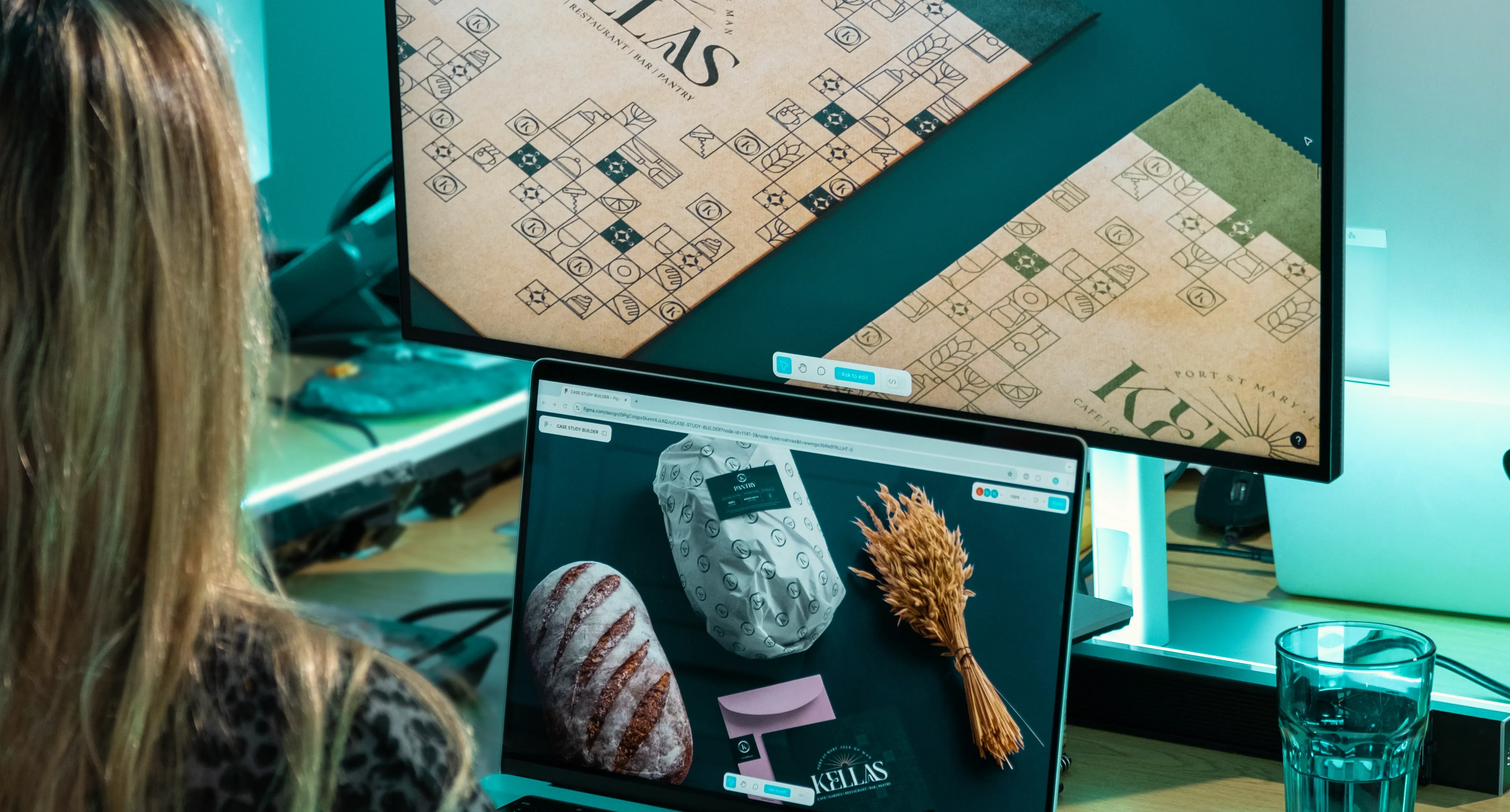
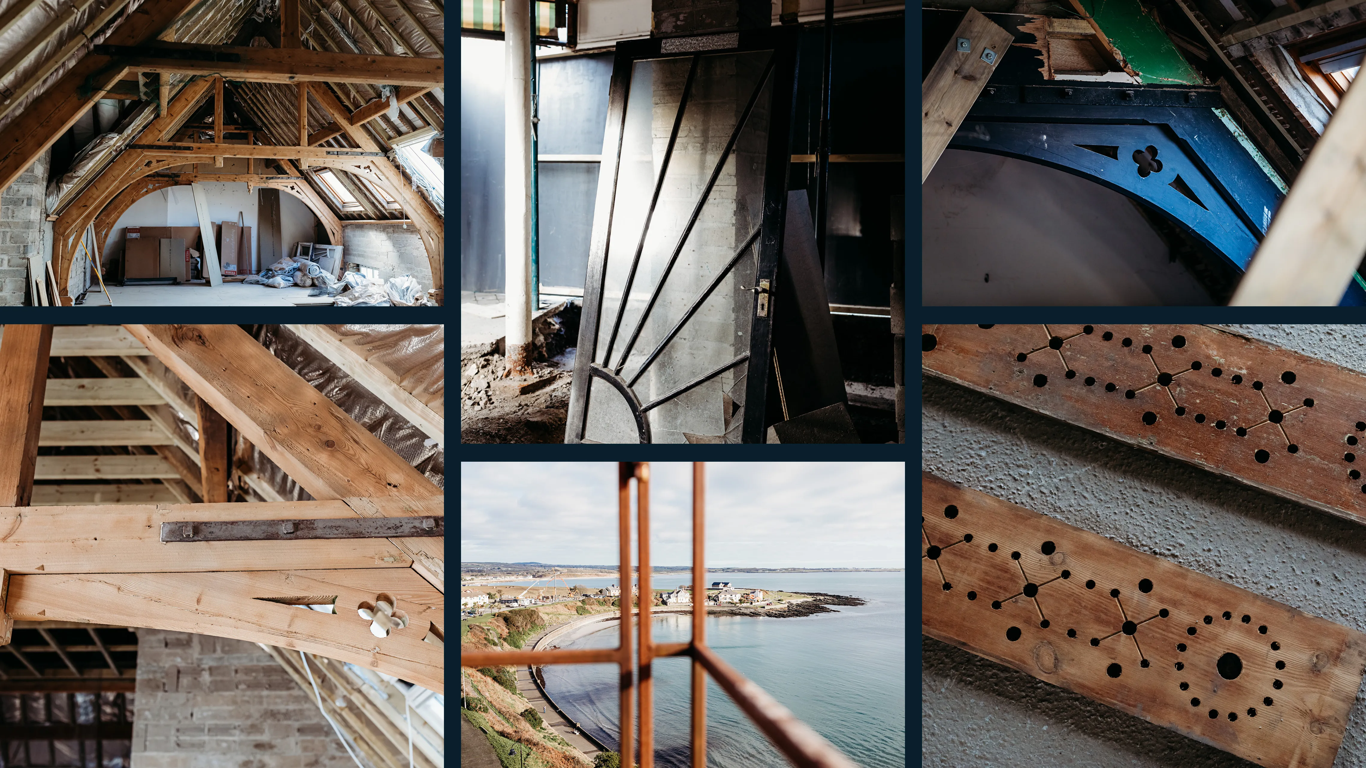
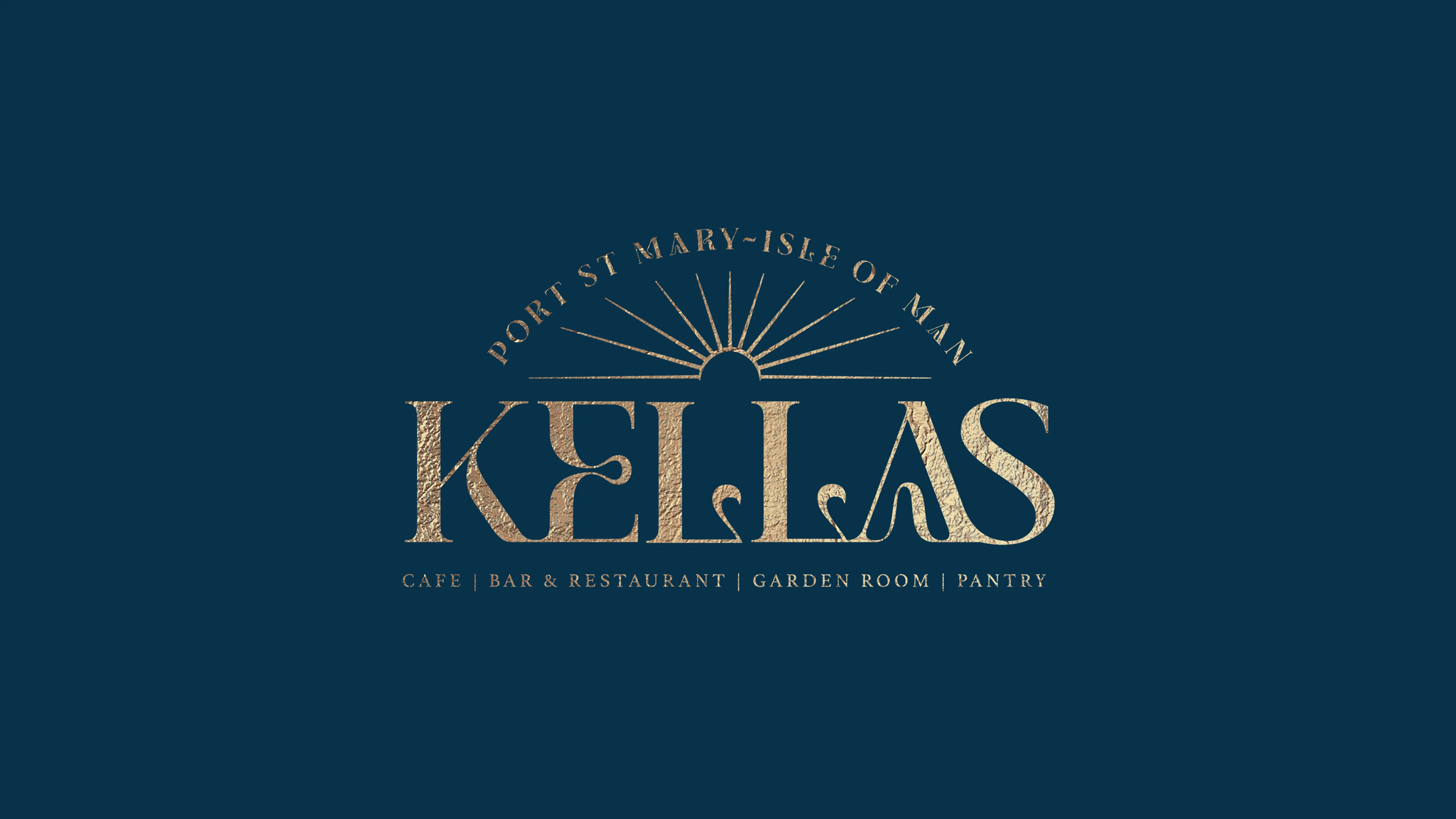
Halfway through the renovation of Manxonia House, the builders took down an old door. Behind the frame, hidden for decades, was a period sun motif pressed into the original design. Nobody had known it was there. That detail inspired the brand. And in some ways, it became the story of the whole project. Something valuable that had always been there, waiting to be uncovered.


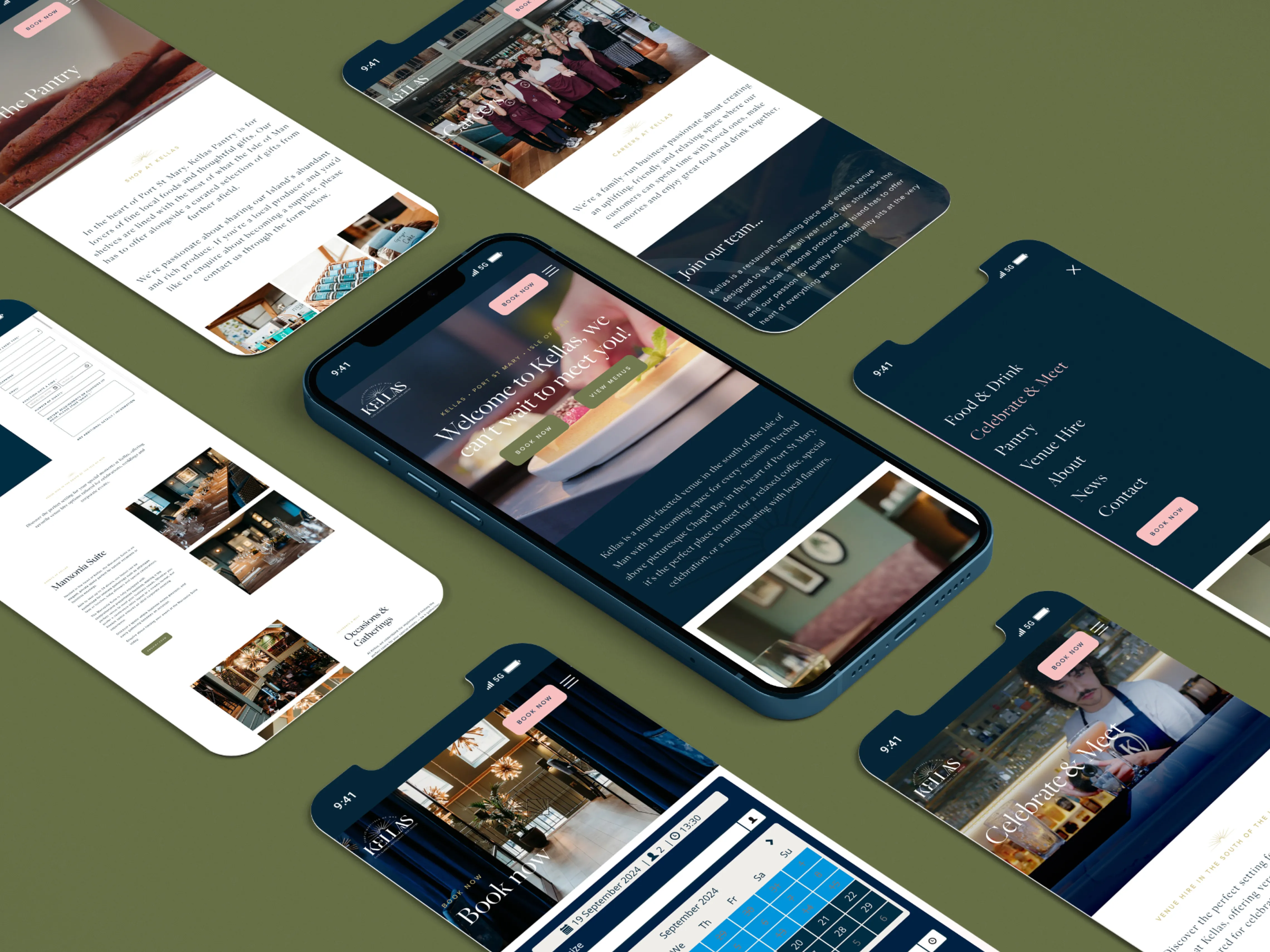
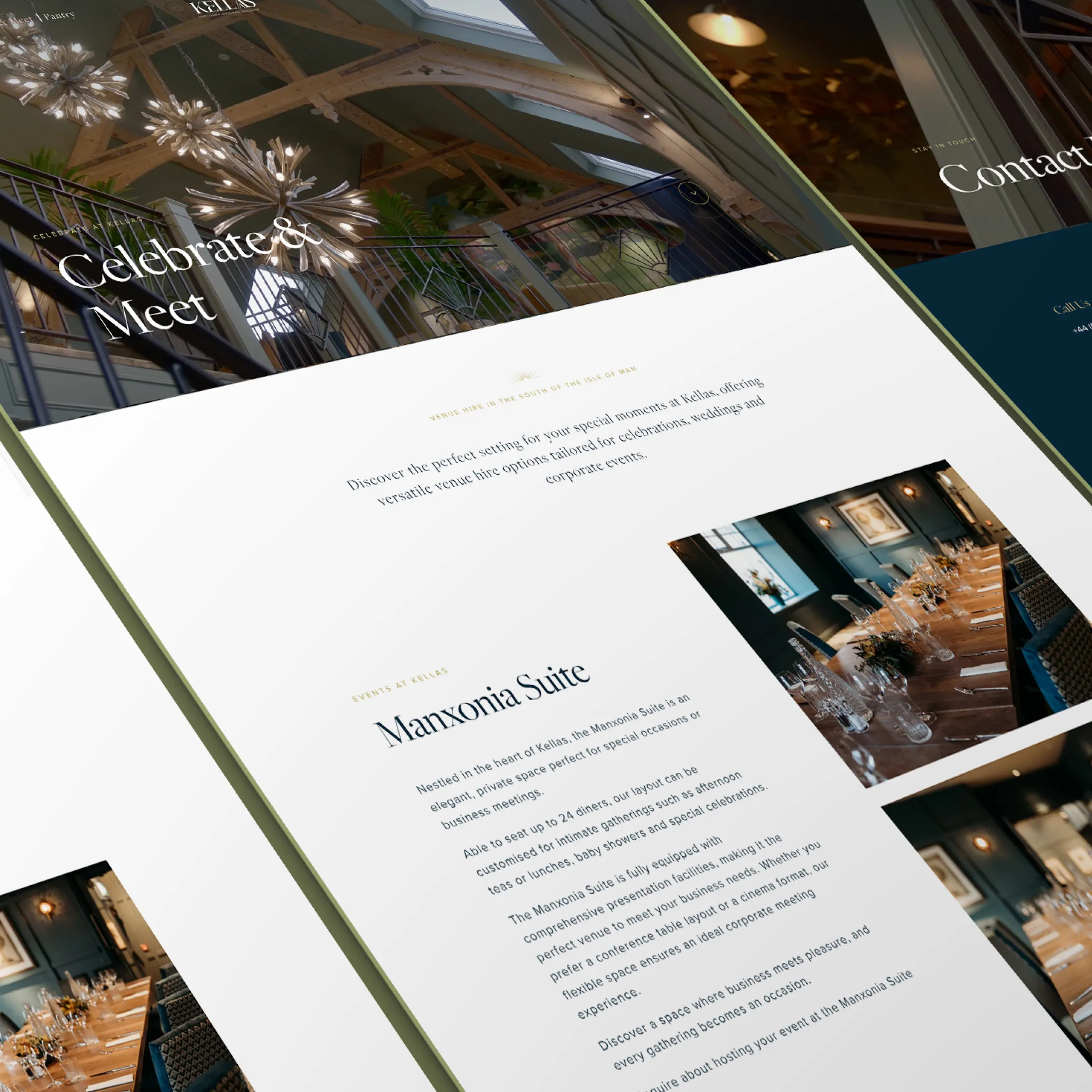
Kellas is a hospitality venue in Manxonia House, Port St Mary, Isle of Man. DotPerformance designed and built the brand identity, visual system, and website for Kellas, drawing from the building's original architectural details including a hidden period sun motif that became the brand mark. The project included wordmark design, iconmark, colour palette, typography, brand guidelines, signage, collateral, and a full website with online booking.

A grid of photographs representing Kella's restaurant and its Isle of Man setting, including coastal scenery, architectural ironwork details, harbour views, and warm interior shots.

A town waiting to come back

Port St Mary had been losing its rhythm. The kind of slow fade that happens to small coastal towns when the places people gather start to close or go quiet. Manxonia House was one of those places. A building with history, sitting underused, its potential obvious to anyone who walked past.

The renovation changed that. But a renovated building without an identity is just a nice space. It doesn't draw people in. It doesn't give a town a reason to talk about it.

Kellas gave the building a name and a voice.

The full Kella's primary logo displayed in gold on a dark teal background, featuring the wordmark "Kellas" with a sunburst above, the text "Port St Mary – Isle of Man" in an arc, and the tagline "Cafe | Bar & Restaurant | Garden Room | Pantry" beneath.

Build the identity from the building

The easy option was something polished and generic. A hospitality brand that could belong anywhere. The harder option was to build an identity from the building itself. Its history. Its materials. Its surprises.

We chose the harder option.

  • Wordmark built around the Jemina typeface, modified letter by letter until the weight and rhythm felt right. Warm, assured, specific to this place.
  • Sun motif from that hidden door became the centrepiece of the brand mark. A detail the building kept to itself for years, now the first thing you see.
  • Iconmark stripped the brand down further. The initial letter held within two ellipses. Simple enough to work embroidered on linen, printed on a menu, or reduced to a favicon.
  • Full identity system spanning colour palette, typography, brand guidelines, signage, and collateral. Each element drawn from the same source material so the brand holds together everywhere it appears.
  • A collection of mobile phone mockup screens displaying the Kella's restaurant website design, shown on a dark olive green background, featuring pages including menus, imagery of food and the restaurant interior.
  • An angled print or screen mockup showing a Kella's restaurant website page for the Marsonia Suite private dining and events space, with the heading "Celebrate & Meet" and interior photography, on a dark moody background.
  • A flat-lay style collection of multiple Kella's restaurant website page mockups including the homepage, Celebrate & Meet, Vision & Passion, and interior pages, displayed overlapping on a dark background with warm restaurant photography.
  • Multiple desktop website mockup screens for Kella's restaurant displayed on an olive green background, showing various pages including homepage, food and drink, and events sections with restaurant photography.
  • Kella's restaurant decorative brand pattern featuring four gold geometric star motifs set within circles, arranged in a square formation on a dark teal background.
  • Kella's restaurant decorative brand pattern featuring four gold geometric star and diamond motifs arranged in a square grid on a dark teal background, rendered in a metallic embossed style.
  • Two Kella's branded kraft paper carrier bags displayed against a dark teal background — one natural brown with the Kella's logo and geometric pattern, and one olive green with the Kella's branding.
  • A styled flatlay on a dark teal background featuring a rustic sourdough loaf, a white branded pantry wrap/packaging with the Kella's pattern, a bundle of dried wheat, a pink envelope, and a dark teal Kella's business card.

Extend it to every screen

The website followed. Online booking, afternoon tea, venue hire, the full scope of what Kellas offers, designed to work across every device. Clear navigation, fast performance, and a tone of voice that matches the experience of walking through the door.

A close-up of the Kella's full logo embossed in a tonal deboss/emboss effect on a gold textured card or stationery, featuring the wordmark "Kellas", sunburst motif, "Port St Mary – Isle of Man" arc text, and "Cafe | Bar & Restaurant | Garden Room | Pantry" tagline.

Give a town somewhere to go

Kellas opened and Port St Mary had somewhere to go again.

Not just a café or a venue. A place with a name people use, an identity people recognise, and a presence that gave the town something it had been missing. The kind of place locals recommend to visitors without being asked. The kind of place that makes people think differently about where they live.

A good renovation saves a building. A good identity gives it a role in the community. Kellas did both.

SubscribeSUBSCRIBE