Hero background
PorchLight Lodging

Innovative new brand and website for intergenerational living.

Read more
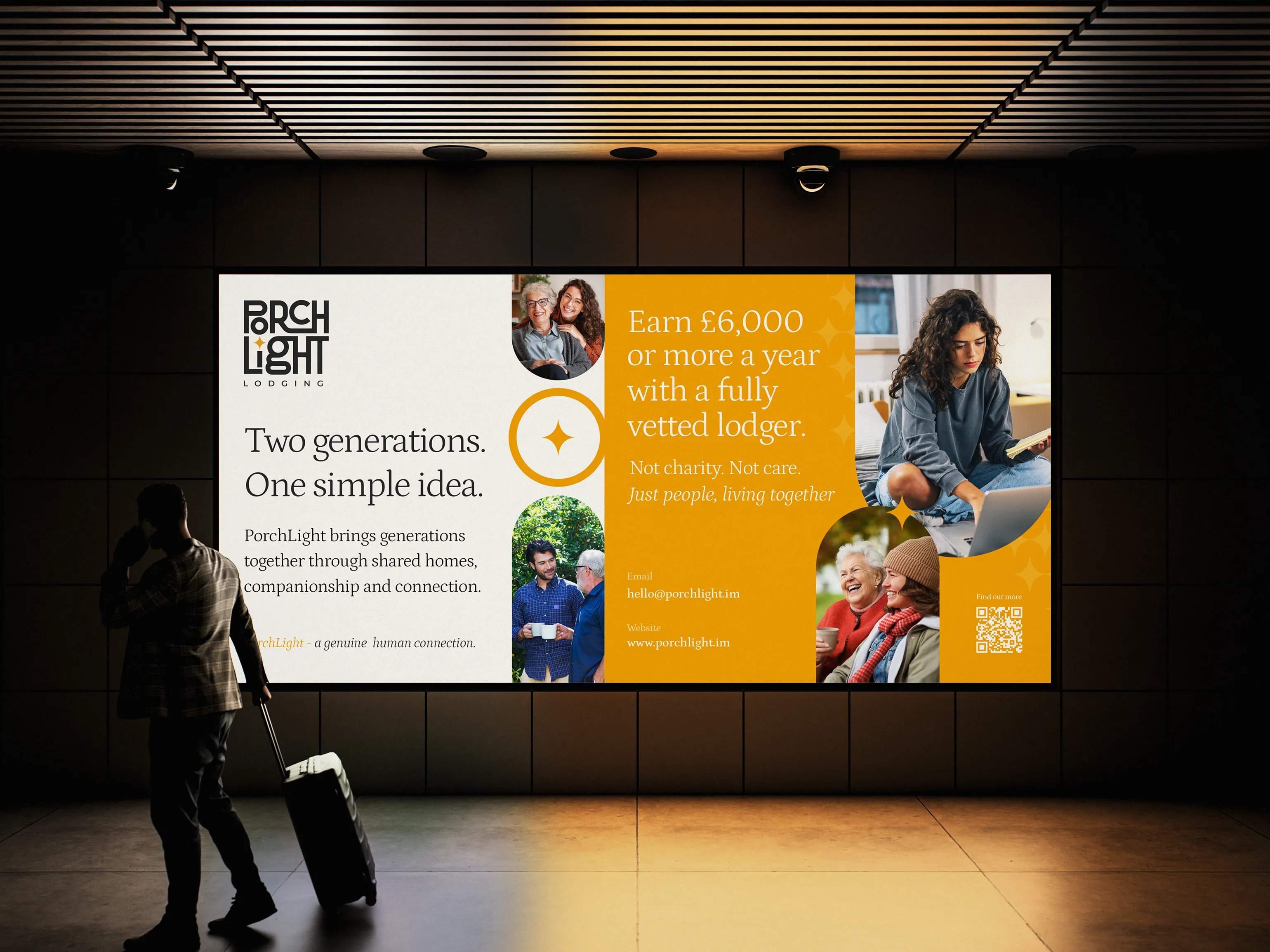
PorchLight Lodging digital billboard reading Two generations. One simple idea. and Earn £6,000 or more a year with a fully vetted lodger, in an indoor concourse

A widowed homeowner in Onchan potters around a four-bedroom house that hasn't been full since the kids left. A nurse moving to the island for a six-month contract can't find anywhere affordable to live. A graduate in their first job is paying rent that swallows half their salary, and is alone most evenings.

Three people. Three problems that solve each other, if someone can connect them.

PorchLight exists to be that someone.

The PorchLight Lodging star and ring symbol, reversed out in white on the brand's mustard gold
PorchLight Lodging logo, a stacked black water mark with a gold star accent, designed by DotPerformance on the Isle of Man
PorchLight Lodging star icon in white on a mustard gold square
Ella Garvey reviewing PorchLight Lodging web content for the case study at DotPerformance

A new idea that needed to feel familiar

PorchLight isn't a property platform. It isn't a charity. It isn't a lettings agent. It's something the Isle of Man hasn't had before: a fully managed housing service that connects homeowners with sharers through intergenerational co-living and traditional lodging. Vetting, matching, support. All of it handled.

That's a lot to communicate. It is also a lot to ask of people. Asking an older homeowner to share their home with someone they've never met requires trust. Asking a young professional to live with someone two generations older requires reassurance. The brand had to do all of that on first contact, before anyone read a word about how it worked.

Laptop, tablet and smartphones floating on gold, each displaying the PorchLight website and its Bright homes, brighter futures headline

Starting before the brand

We came in early, while the idea was still an idea. Jamie brought us the concept, and before there was a name or a logo, there were questions that had to be answered: who exactly is this for, what each side stands to gain, where does the service stop, and how does any of it make money.

We worked through it together, defining the proposition and the shape of the business alongside the brand rather than after it. Two customer groups with almost nothing in common, except that each holds the answer to the other's problem. Two related but separate offers, intergenerational co-living and traditional lodging, which needed to sit under one roof without blurring into each other. A managed service model where PorchLight carries the vetting, matching and ongoing support, because that is the part that makes the whole thing possible.

We mapped the journey for both sides, from first enquiry through vetting and matching to living arrangements that work long term, and worked out what had to be true at each step for someone to keep going rather than quietly close the tab. Those decisions shaped everything that followed. The identity, the language, the structure of the site and the order in which information is given all came out of the business model, not the other way round.

What we built

Proposition, brand, collateral, and website, all from scratch.

Concept and service design. The positioning, the offer structure and the customer journeys described above. The work that decided what PorchLight is before anyone decided what it looks like.

Brand identity. Warm, optimistic, honest. A name and identity that nods to what it actually feels like to come home and find the light on. Typography that's confident without being corporate. A palette that feels domestic, rather than institutional. An identity that says people live here, not please review our terms.

Collateral. Every piece of print and digital material a new service needs to introduce itself. Homeowner packs, sharer guides, signage, brochures. All of it built to do one job: make a brand-new concept feel like something you can trust on first glance.

Socials. PorchLight was asking people to try something unfamiliar, so we led with empathy, not explanation. Moody, question-led posts came first, asking things our audience had already wondered, like 'How many rooms on this island are sitting empty tonight?'. Carousels and stories then did the explaining: why PorchLight exists, how home sharing works, and what an empty room could earn. The result takes people from "that's a real problem" to "this could work for me."

Website. A single home for both audiences, each with their own journey, language and reassurance. Find-a-Room functionality. Application flows for both sides of the service. A tone that holds steady whether someone arrives looking for income, accommodation or community.

  • PorchLight Lodging Bright Homes. Brighter Futures. poster in an outdoor display case on a tree-lined street in autumn
  • PorchLight Lodging business cards for Jamie Stott, Managing Director, with the star symbol on the reverse, on a gold background
  • Cream canvas tote bag printed with the PorchLight Lodging logo, resting on a wooden cane-back chair in warm sunlight
  • Hands holding a PorchLight Lodging flyer by DotPerformance explaining its two services, lodging and intergenerational co-living
  • Natural cream PorchLight Lodging hoodie with a navy logo, gold star and gold drawstrings, on a gold background
  • Black PorchLight Lodging hoodie with a cream logo, gold lettering and gold drawstrings, on a gold background
  • White PorchLight Lodging mug with a gold interior on a hessian cloth beside dried flowers and a potted plant
  • Woman adjusting a black cap embroidered with the white PorchLight Lodging logo and a gold star on the peak
  • Woman with long dark hair wearing a cream PorchLight Lodging T-shirt with a small chest logo
  • Close crop of a man in a cream PorchLight Lodging T-shirt, with the small stacked logo printed on the chest

A brand doing serious work

PorchLight launched with an identity that carries the weight the service requires. People understand what it is. They understand who it's for. And they understand, before they pick up the phone, that they're dealing with something credible.

The site moves cleanly between audiences without ever feeling like two websites stitched together. Co-living and lodging each have room to breathe, but the brand holds everything together.

For a service whose entire proposition depends on trust, the first impression had to do real work. It does.

Nine PorchLight Lodging Instagram posts in a grid, pairing photos of different generations with lines such as Two crises. One answer.

Built to grow

PorchLight is solving two problems at once. A housing market that prices out the people the island most needs and a quieter problem: older homeowners with more space than company, and the slow erosion of connection that comes with it.

The brand and service model are designed to grow with that mission. As the service expands and the community of homeowners and sharers grows, the identity can flex and the model can extend without losing what it stands for.

Some businesses sell a product. Some sell a service. PorchLight is selling something harder: the idea that opening your door to a stranger can be safe, supported, and good for everyone involved.

The brand makes that idea feel obvious. That's what it was built to do.

SubscribeSUBSCRIBE