Kellas

Brand & website.

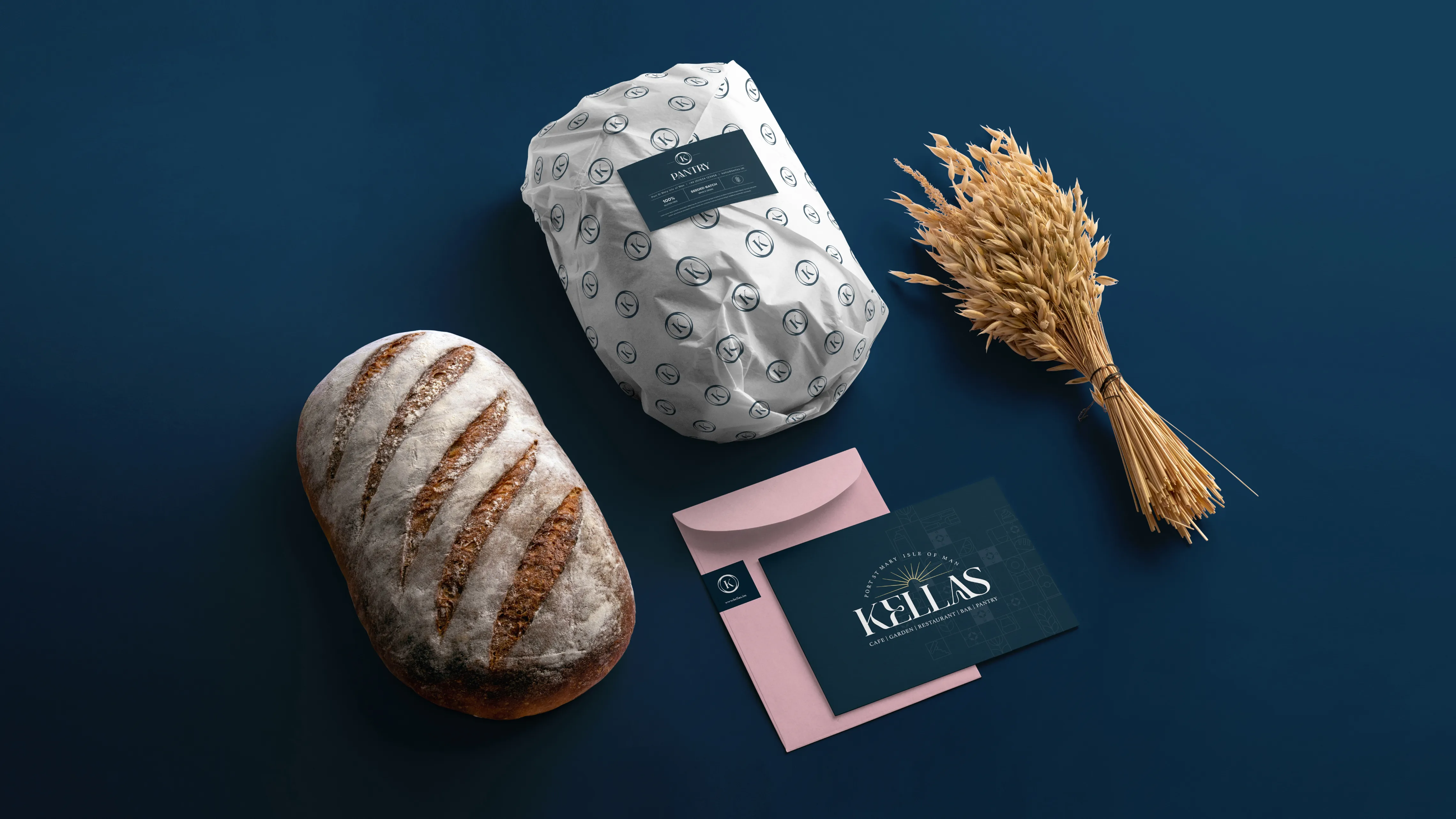
A sophisticated new brand for Kellas, an exceptional cafe, bar, restaurant, garden room, and pantry located in Port St Mary, Isle of Man.

Visit Website

Dynamic lettering

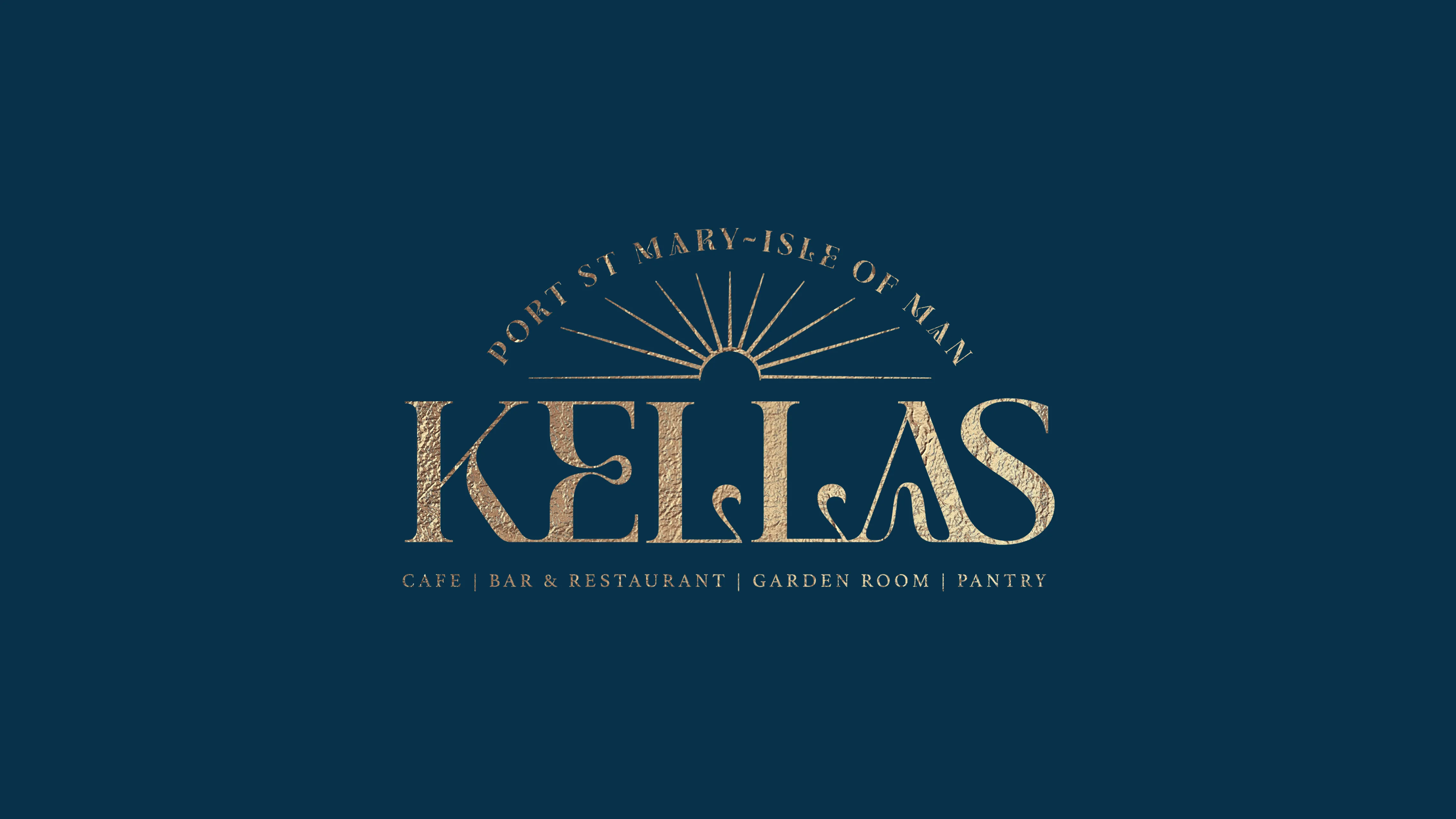
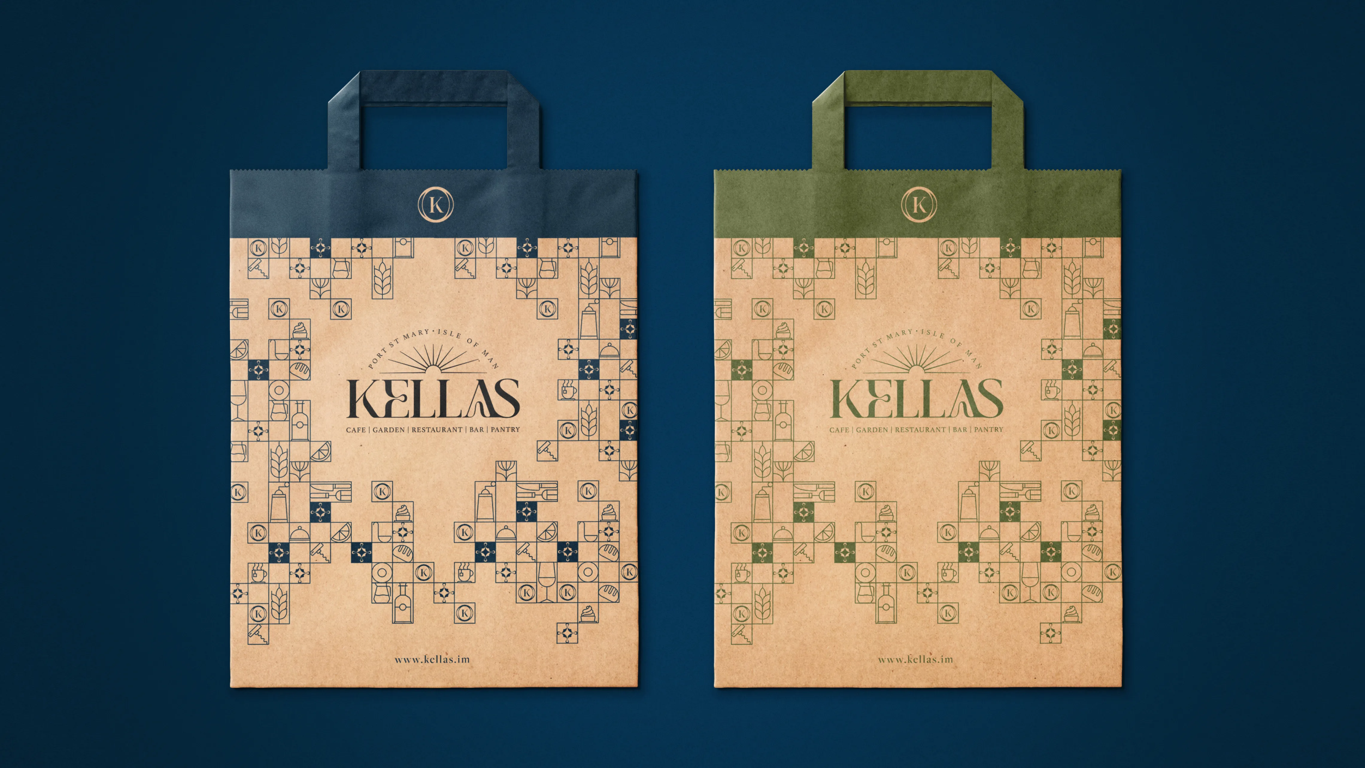
The initial focal point within the Logomark is the stylized Kellas Wordmark. This style strongly ties a brand’s visual identity to the company name. This dynamic lettering stands out as the defining feature; crafted around the Jemina font, the letters have been purposefully modified to seamlessly align with Kellas' overarching vision.

Sun Motif

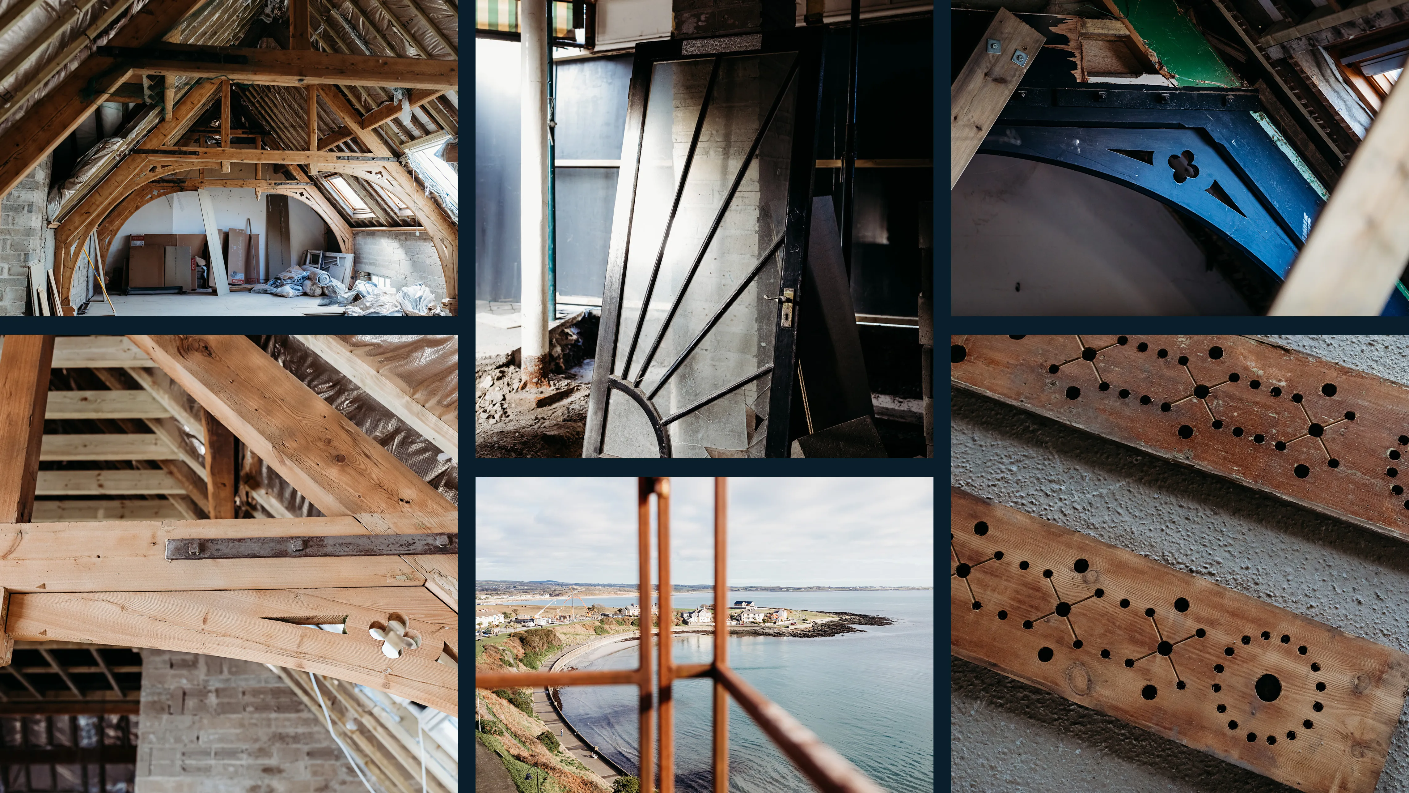
Enhancing its iconic appeal, Kellas' wordmark is adorned with a stylized sun, inspired by the historical decor of the building. A noteworthy moment emerged during the renovation phase when an old and large door was unveiled, exposing a period sun motif in its design. This discovery sparked the creative insight to incorporate this distinctive feature into Kellas' new logo, thereby offering a heartfelt and poignant tribute to the rich history of the building.

Iconmark

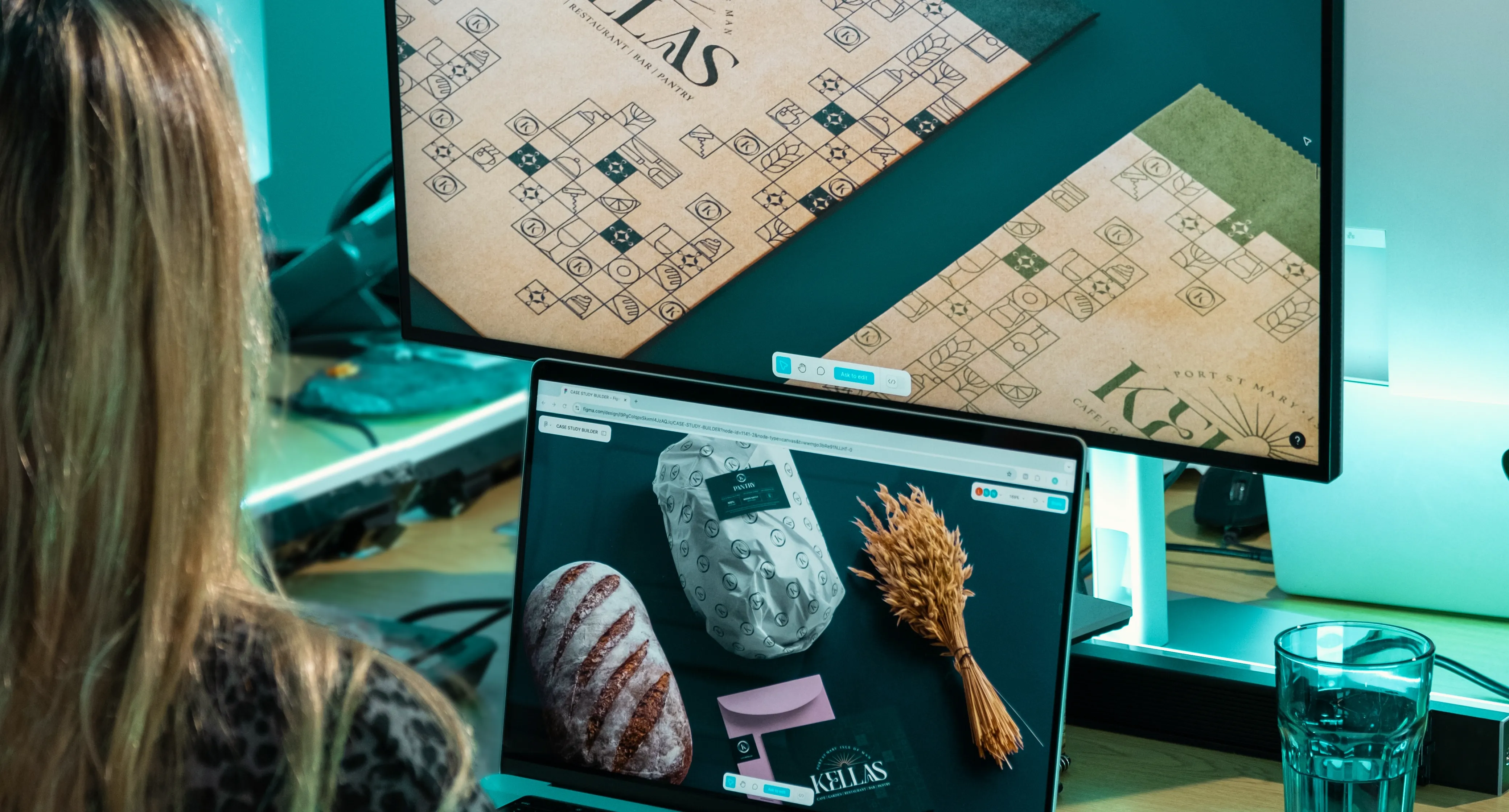
The Kellas Iconmark stands as the brand's most concise graphic representation. Crafted as an abstraction, it incorporates the initial letter of the Kellas name within the embrace of two ellipses. This emblem not only encapsulates the essence of Kellas' identity but it also articulates a continuous and unbroken flow, a profound sense of wholeness and completeness underscoring the notion of seamless and harmonious operations.

Website

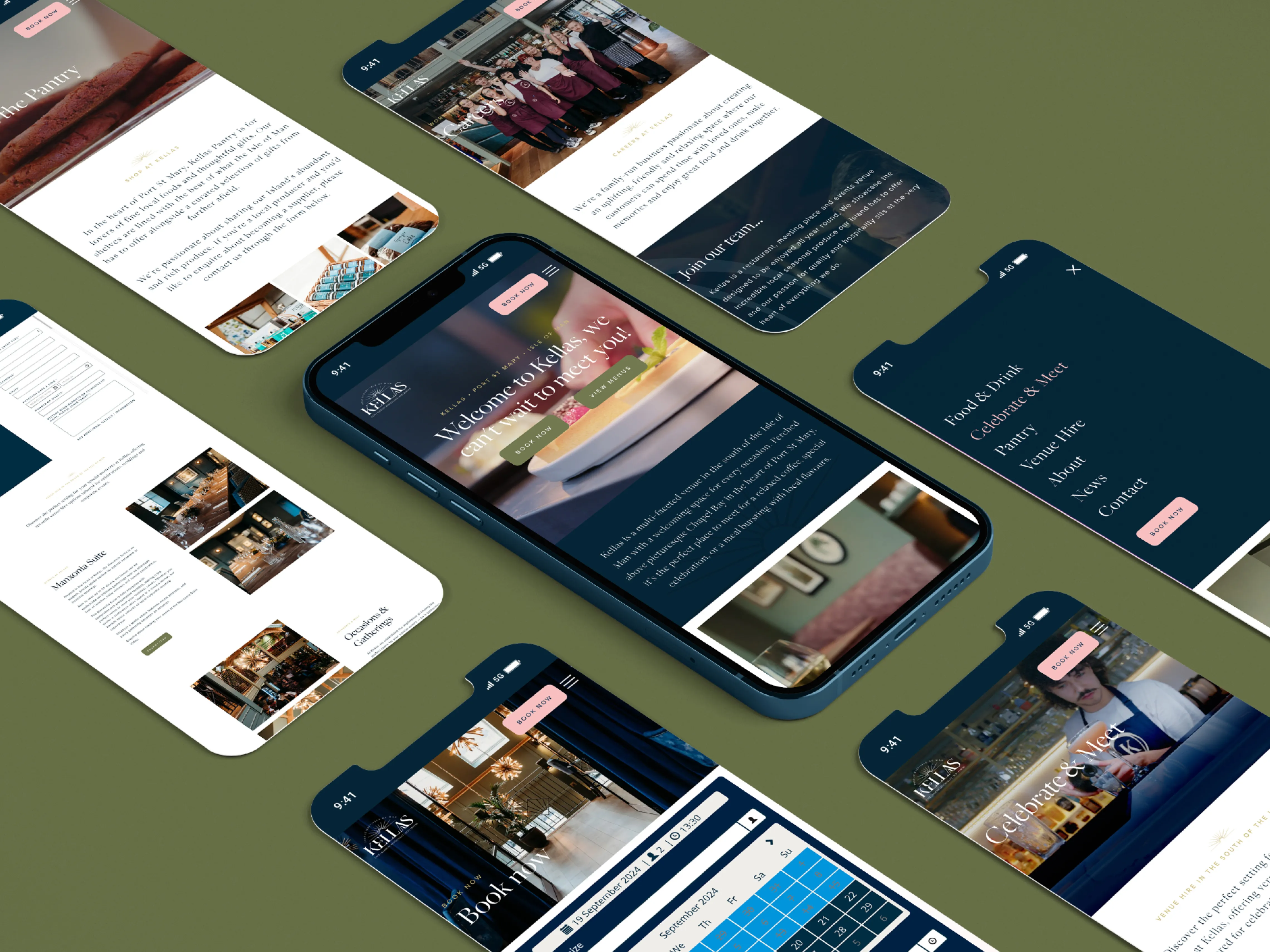
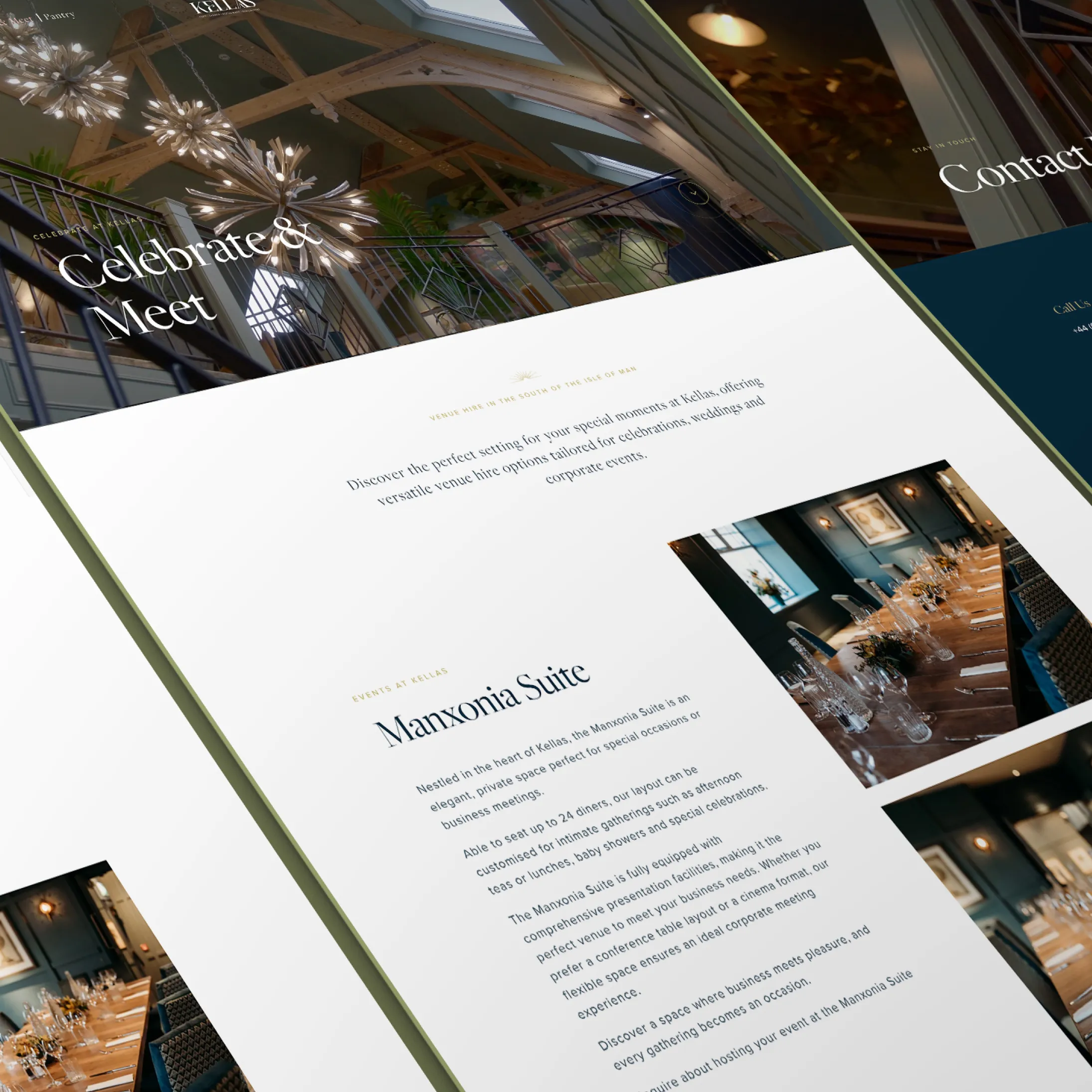
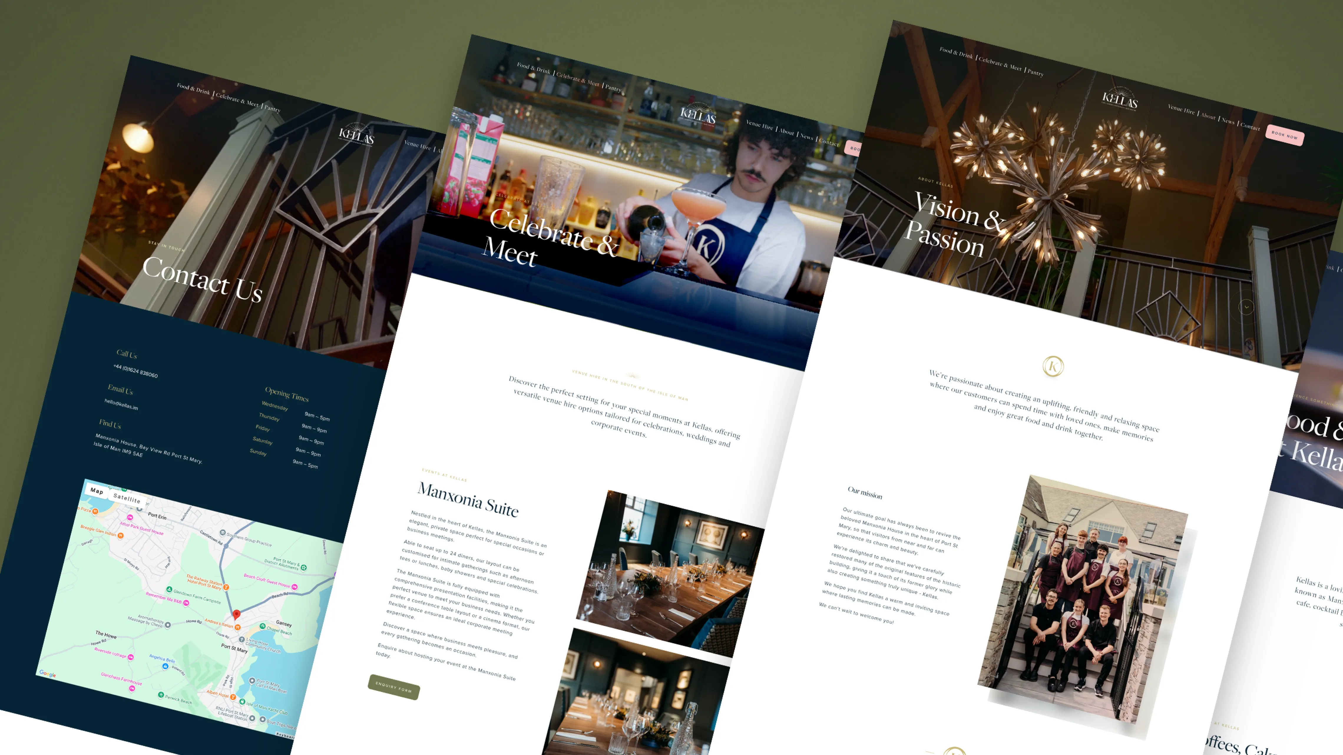
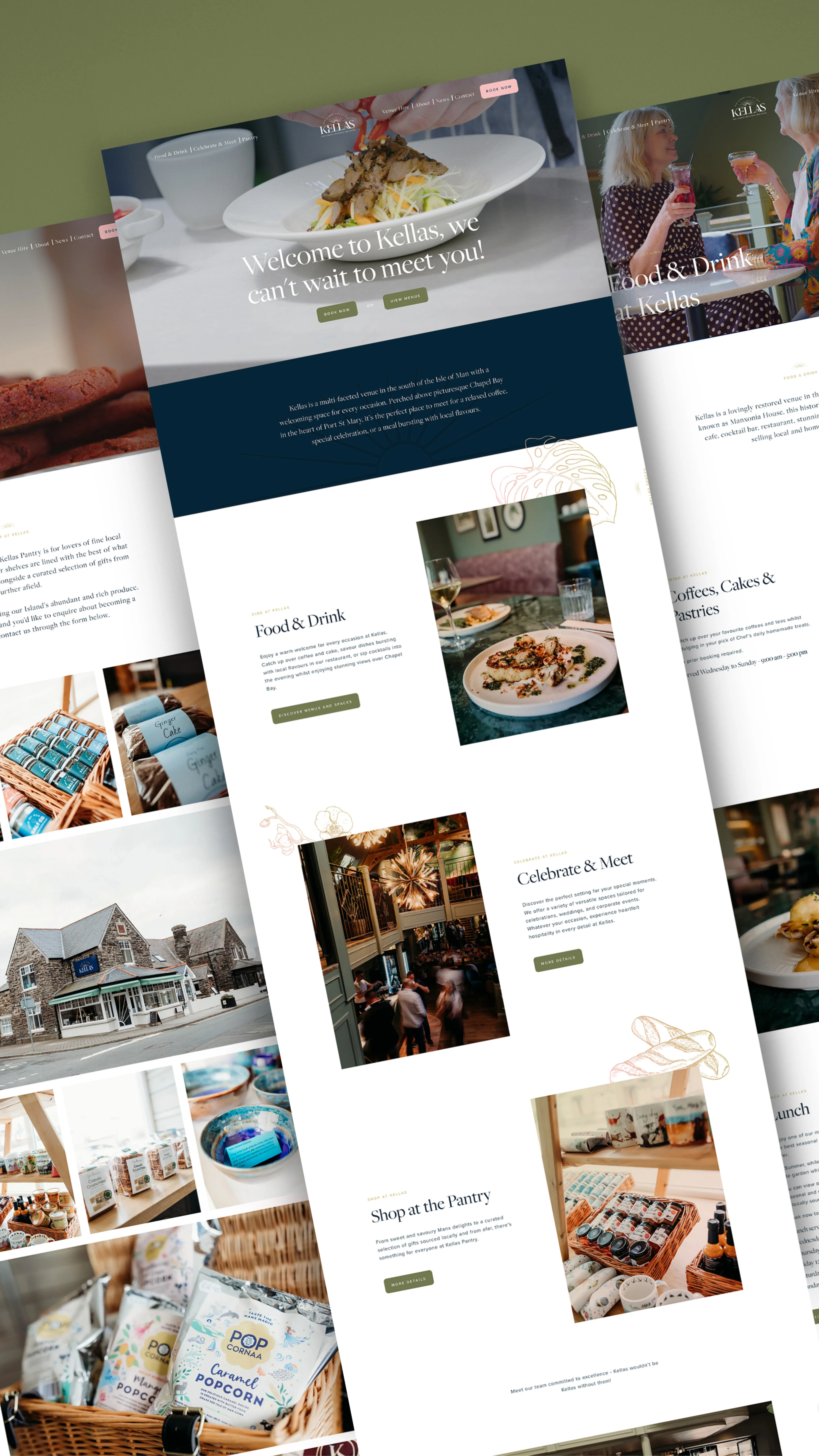
We've recently expanded our work with Kellas, moving from brand development to the launch of their new website. Designed to reflect the Kellas brand, the site offers a seamless, responsive user experience where visitors can easily book online, explore their culinary offerings such as afternoon tea, and learn about venue hire options. The site blends sleek design with functionality, ensuring the brand identity is fully realised across all devices.

Interior photographs courtesy of Amore du Plessis / Kellas.